Paubox (Brand)
BRANDING
After Paubox received its initial brand guidelines in 2021, I led efforts to evolve and refine the visual identity across marketing and product touchpoints. My goal was to enhance the brand’s flexibility, highlight our customer-first philosophy, and create a more dynamic visual system that could scale across campaigns and channels.
The existing brand system provided a strong foundation, but it lacked flexibility for multi-channel campaigns and opportunities to showcase Paubox’s commitment to customer feedback. The challenge was to evolve the brand in a way that remained cohesive while allowing us to visually celebrate the people we serve.
Approach / Role
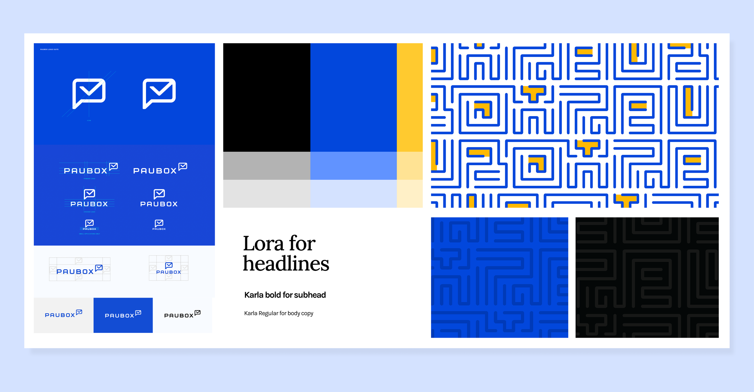
Added a secondary color to increase visual flexibility and enhance hierarchy across touchpoints.
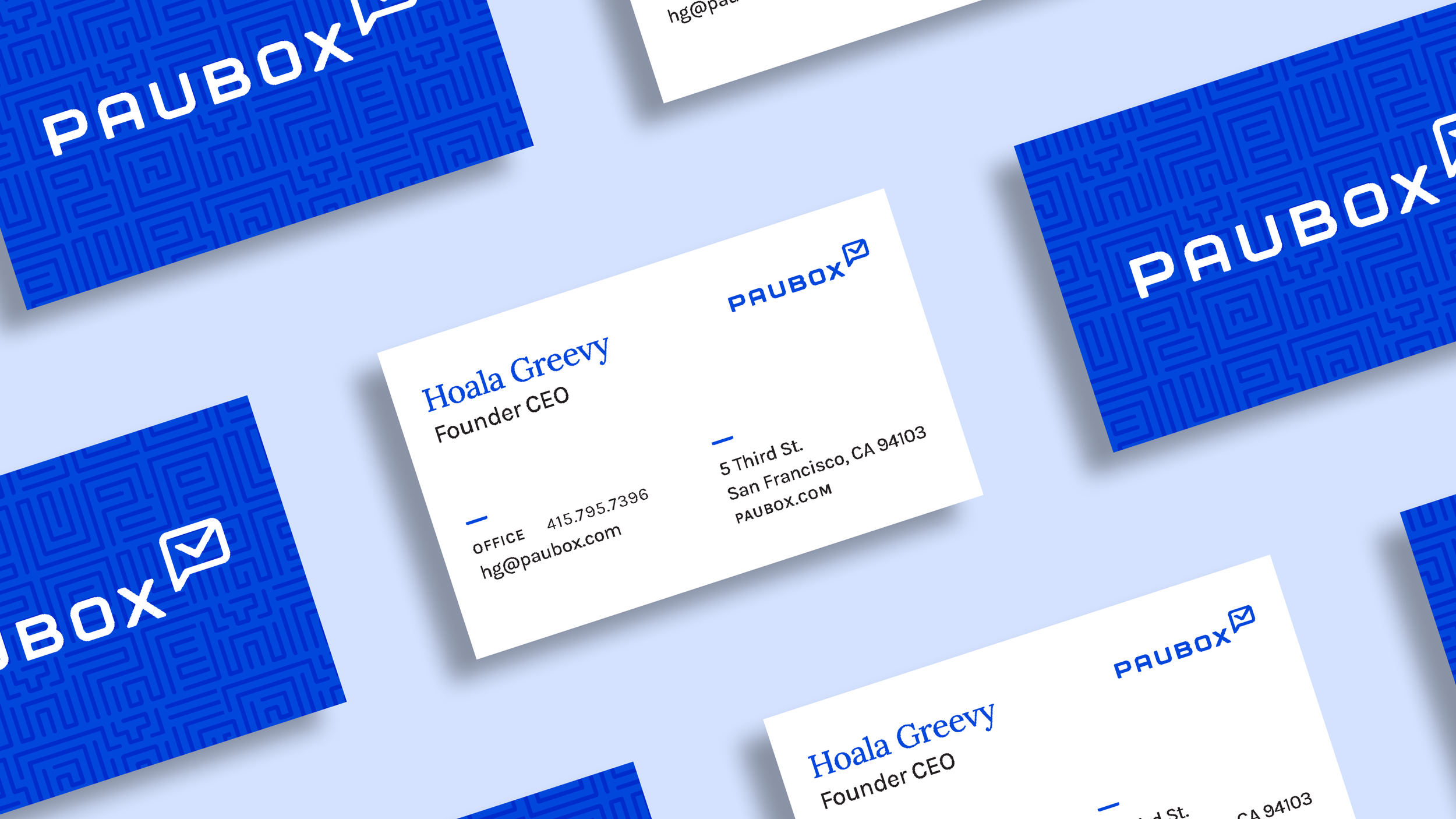
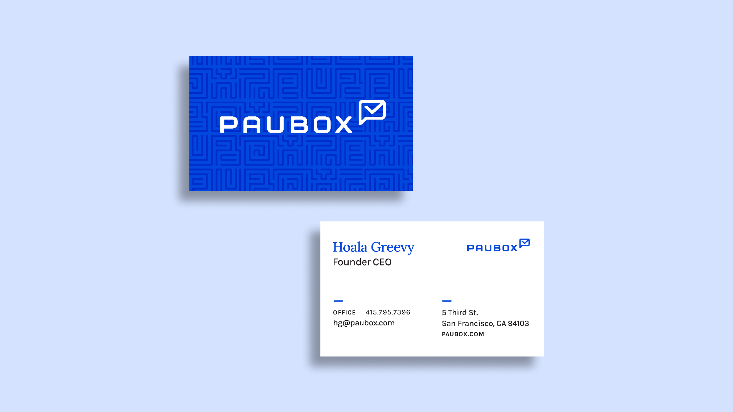
Evolved the existing brand pattern (maze imagery) to work dynamically across digital and print campaigns.
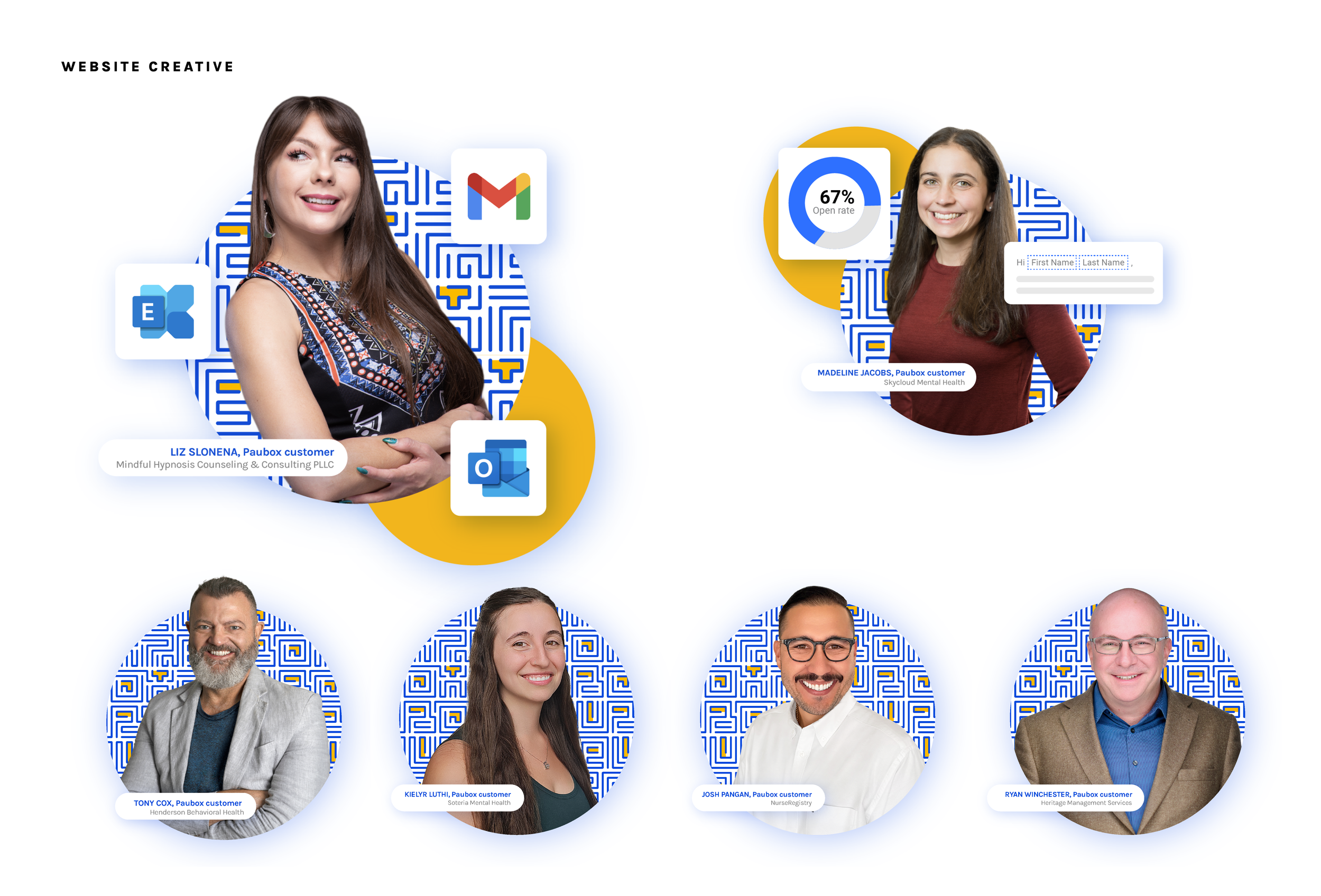
Integrated customer photography within the pattern to highlight Paubox’s customer-first philosophy and showcase that we listen to feedback.
Company: Paubox
Role: Senior Designer
Note: Work in Progress
This project page is a work in progress. I’m continuing to add more examples and context showing how we’ve evolved the Paubox brand across marketing and product touchpoints. Please check back soon for updates and additional visuals.